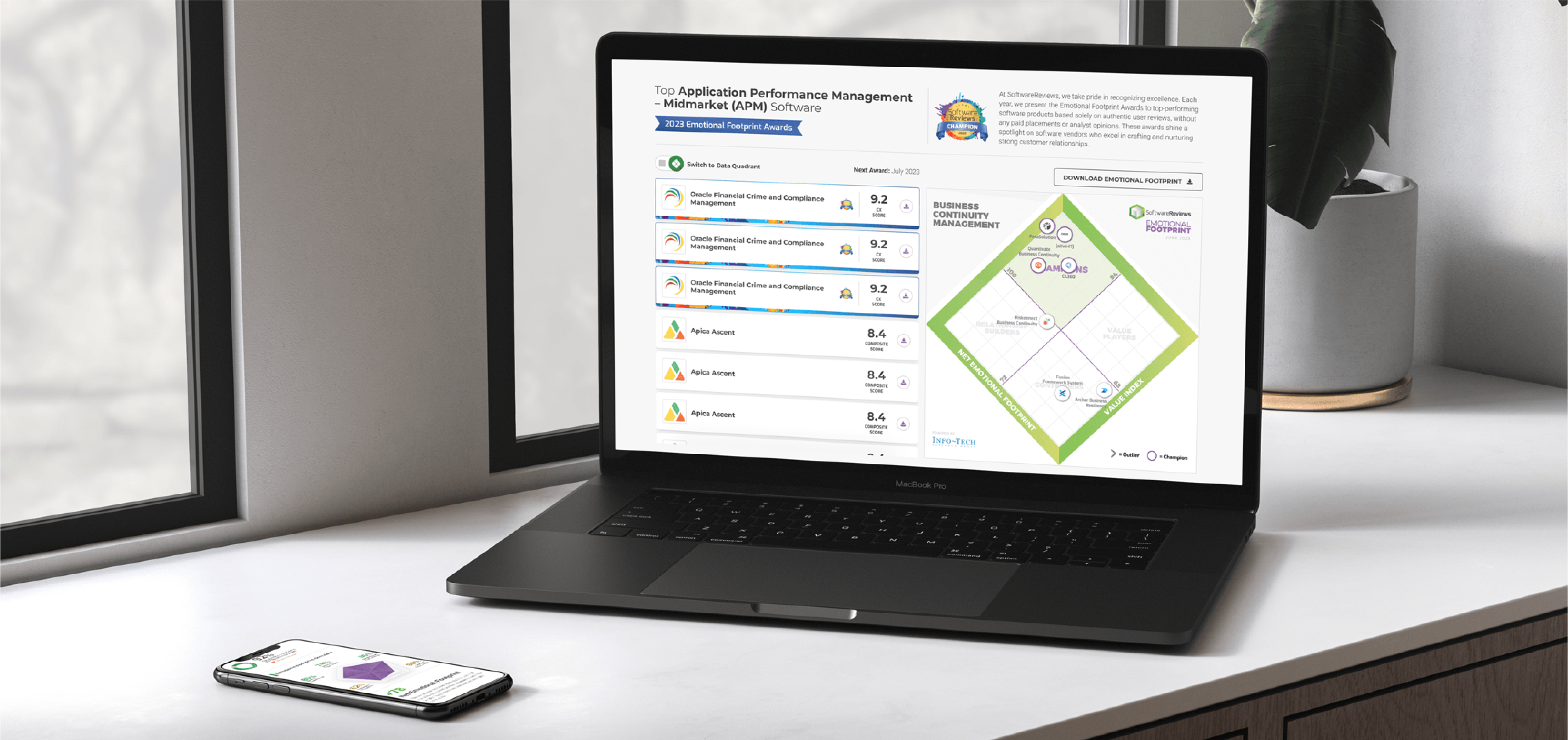
Buyers researching software on SoftwareReviews couldn't get to the information that actually
drove their decisions. Detailed reviews and report data, the platform's most valuable asset
lived in separate, static PDF reports instead of on the pages where users were already comparing
products. Users had to leave the page, open a document, and hunt for the data point they needed.
It was a disconnect between what SoftwareReviews was best at (rich, credible review data) and what
the page was actually showing people.
As Design Director, I set the direction for fixing that gap: bring the data users cared about most
directly onto the Category and Product pages, without burying it under everything else the business wanted to say.
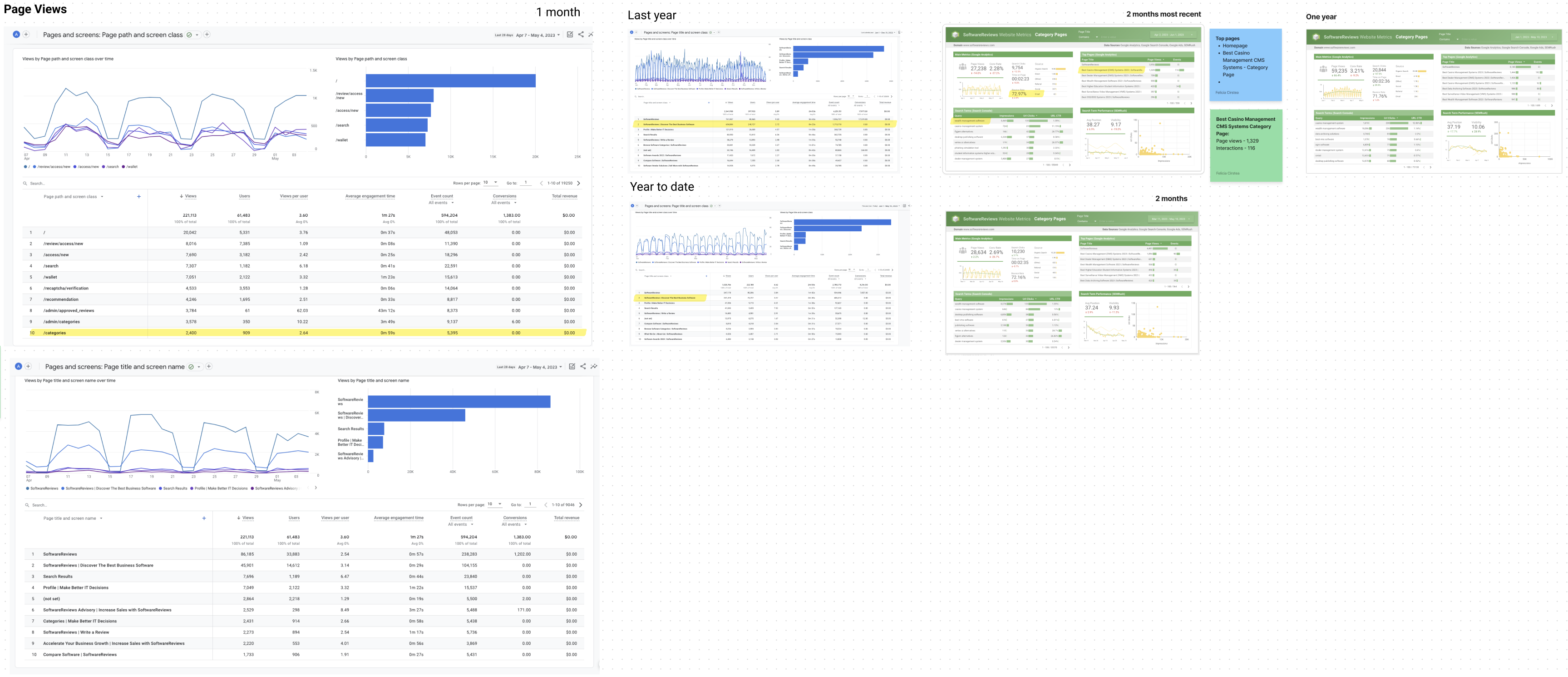
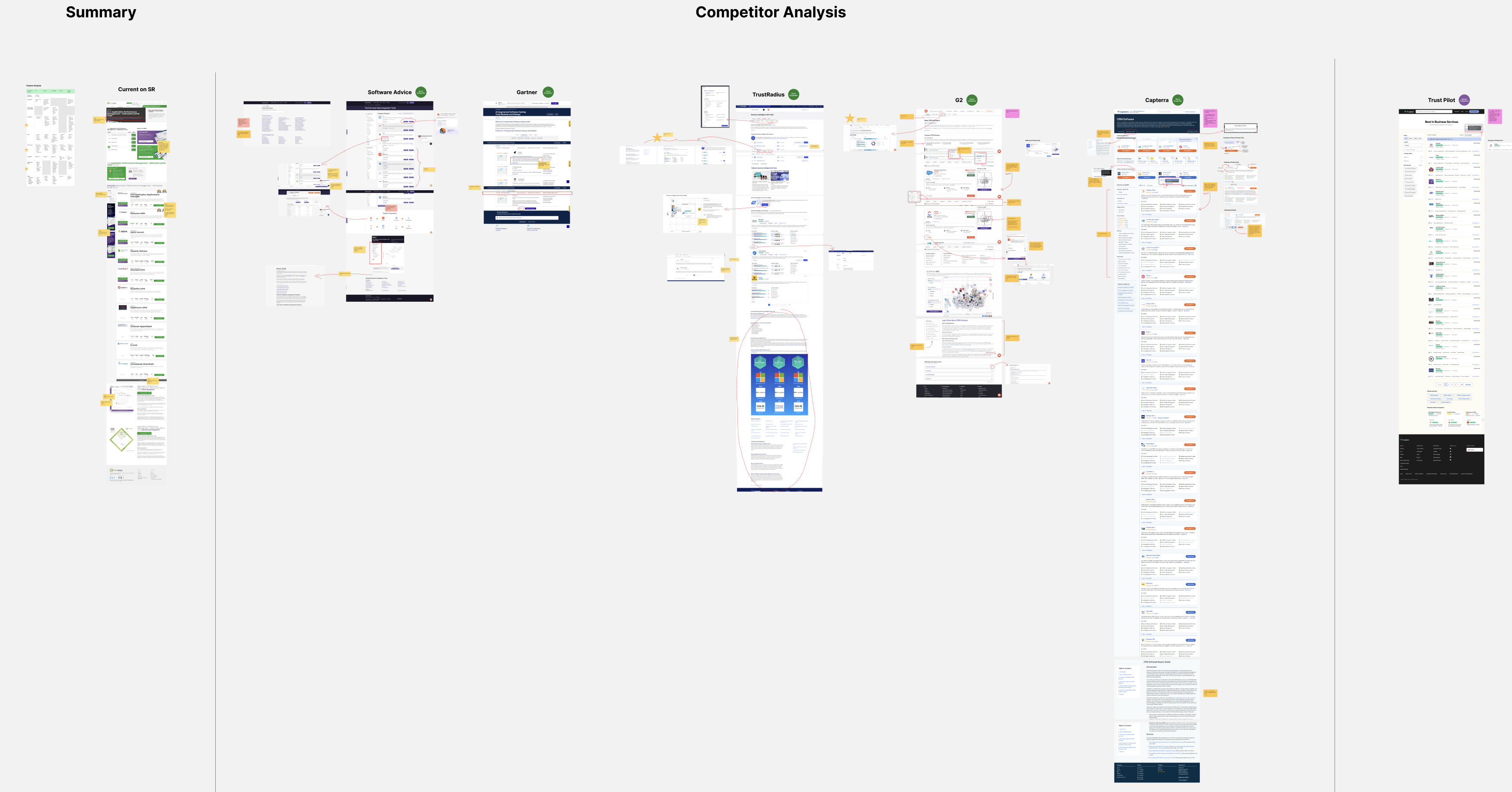
Before proposing a direction, my team and I pulled user behavior data on the existing
pages and audited how competitors in the software-review space structured their
comparison and product pages. Two things stood out: users were scanning for review
scores and category standing first, and almost everyone bounced off the page before
ever finding the deeper report content, because it wasn't visible without a click-through.
That data became the foundation for every design decision that followed, and later the thing that won the argument internally.
Not everyone agreed on what should be prioritized. Stakeholders had strong opinions about what
belonged above the fold, often shaped by what different departments wanted to promote, rather
than by what users were actually looking for first. My own team, meanwhile, needed to be convinced
that a data-first, less decorative layout was the right call before they could design it with conviction and defend it themselves.
I ran two tracks in parallel:
With stakeholders: we walked them through the user behavior data directly, showing where users
were actually looking, clicking, and dropping off on the existing pages to make the case for
a specific content hierarchy, rather than arguing from opinion.
With my team: I pushed multiple rounds of design iteration specifically aimed at building a
version of the page strong enough to sell the idea internally, not just functionally correct,
but persuasive.
The version that ultimately won wasn't a pure "designer knows best" layout. It combined what the
user data and competitor research told us with the stakeholders' priorities giving their content
a real, considered place in the hierarchy rather than removing it, while still putting review data
and category standing where users looked first. That's what got buy-in: stakeholders could see their
input reflected, and the layout still solved the actual user problem.
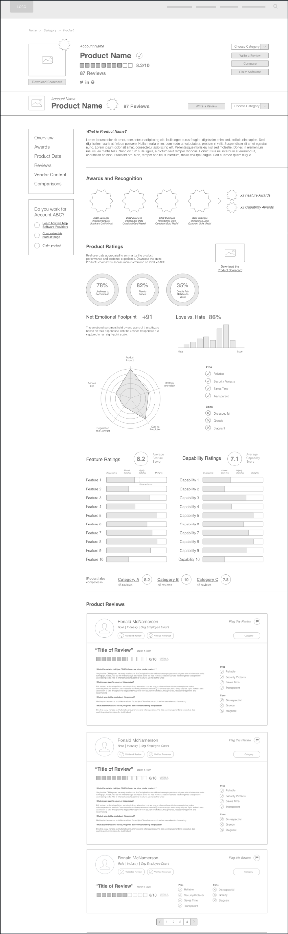
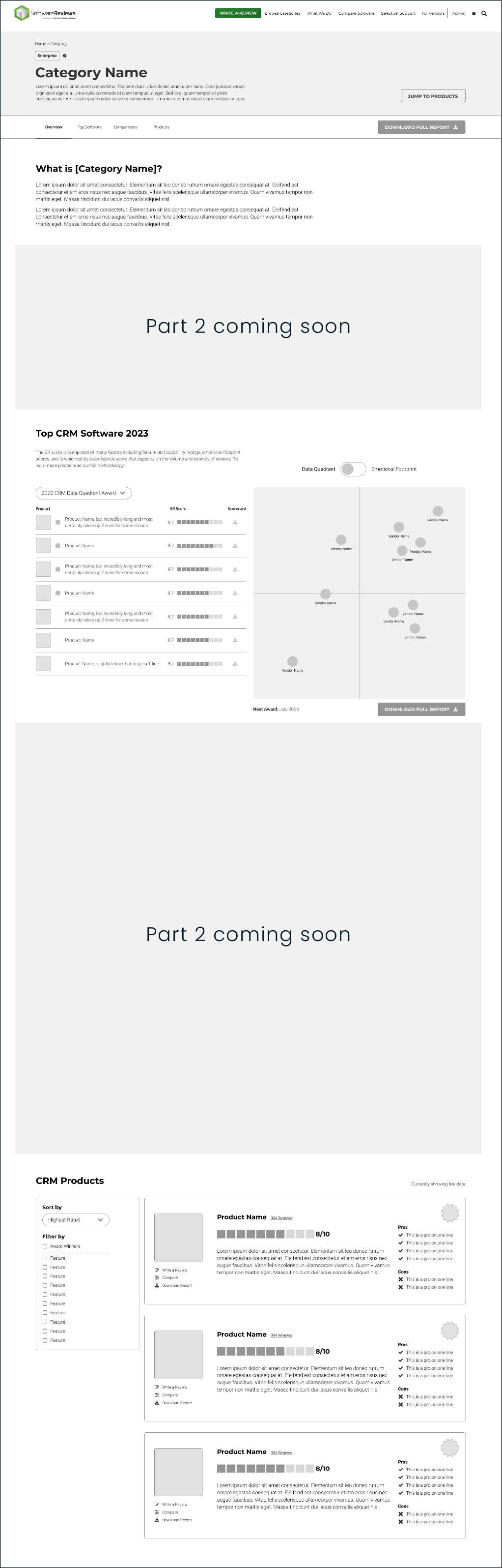
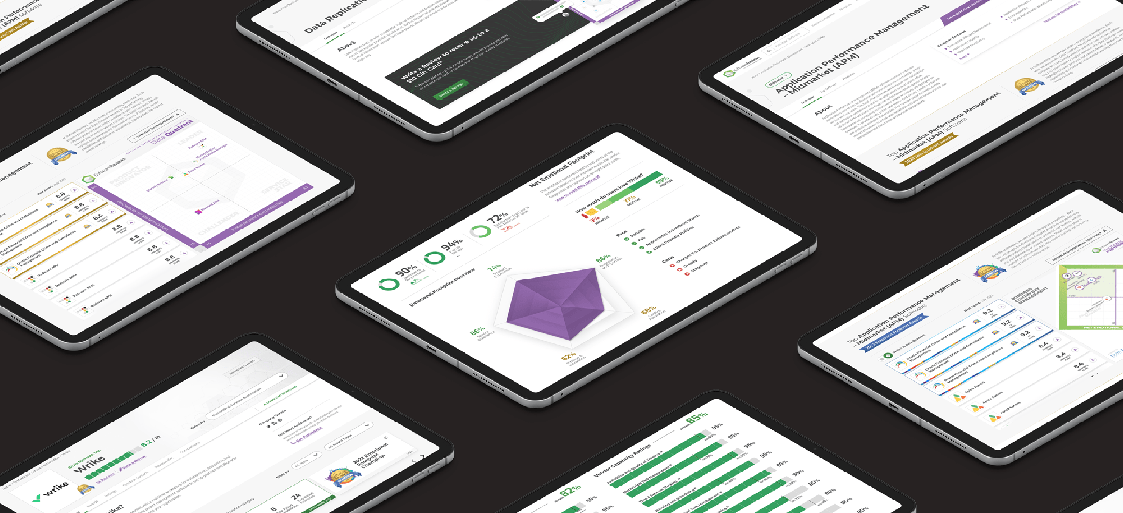
We restructured the pages so review data and medal/category standing, previously locked inside downloadable reports, became a first-class part of the page itself, using clear data visualization instead of dense report formatting. The new hierarchy let users compare products and see where they stood in their category without leaving the page.

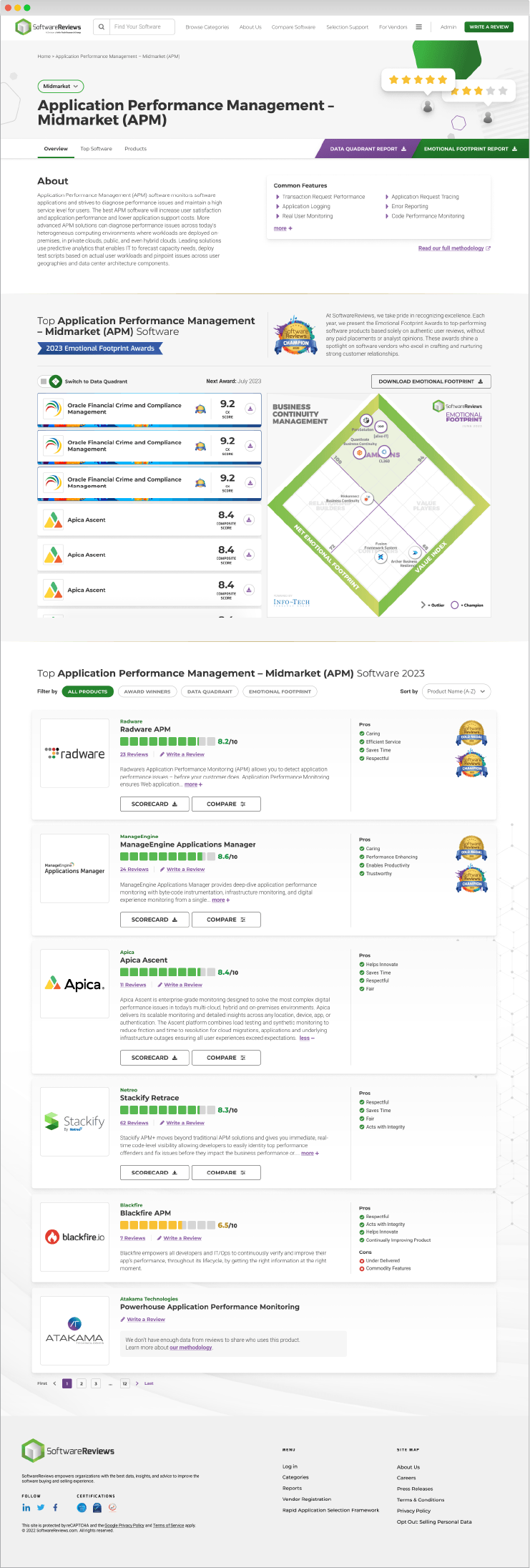
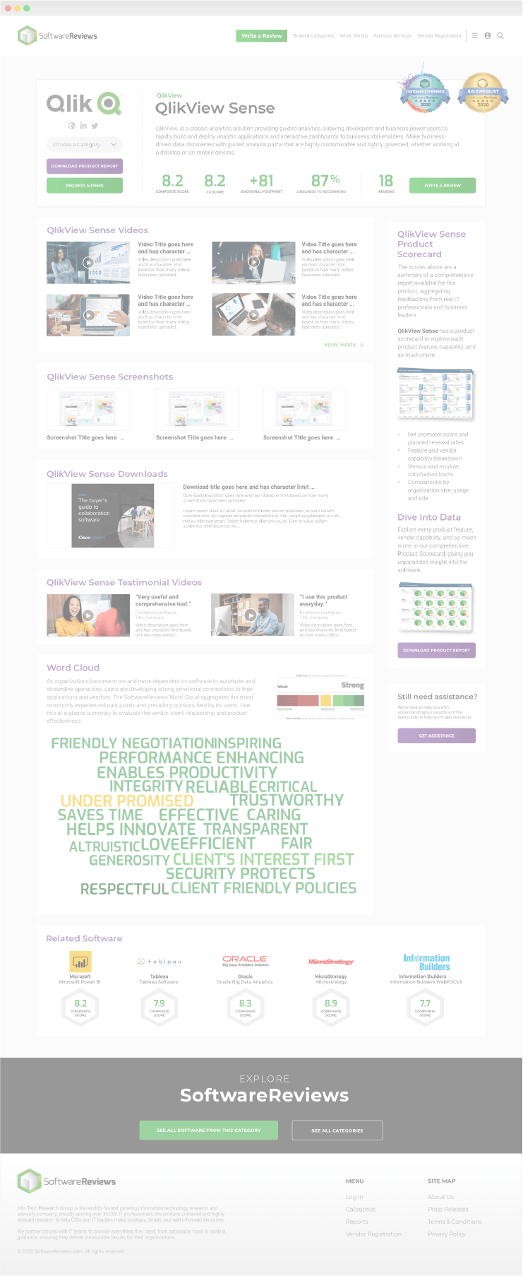

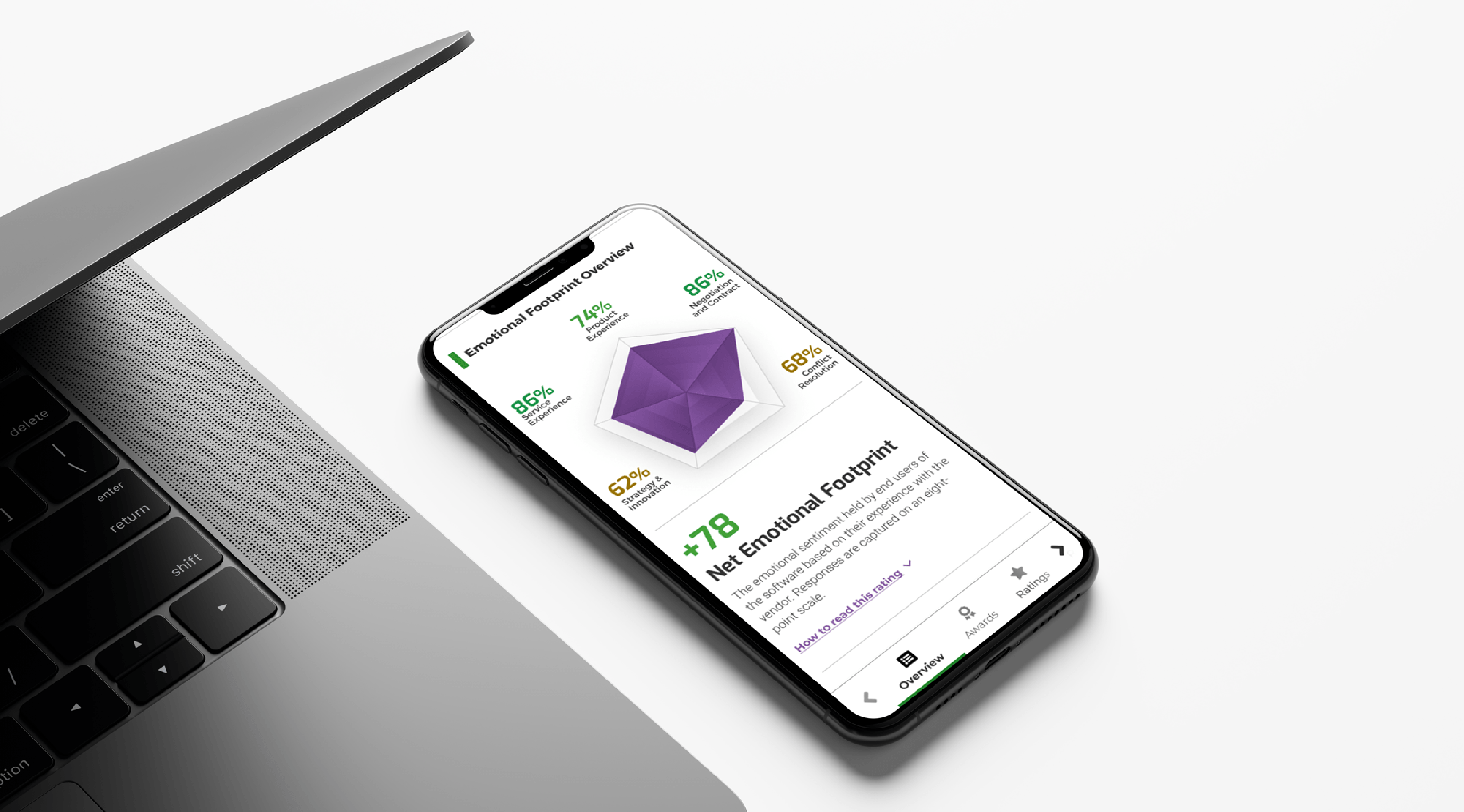
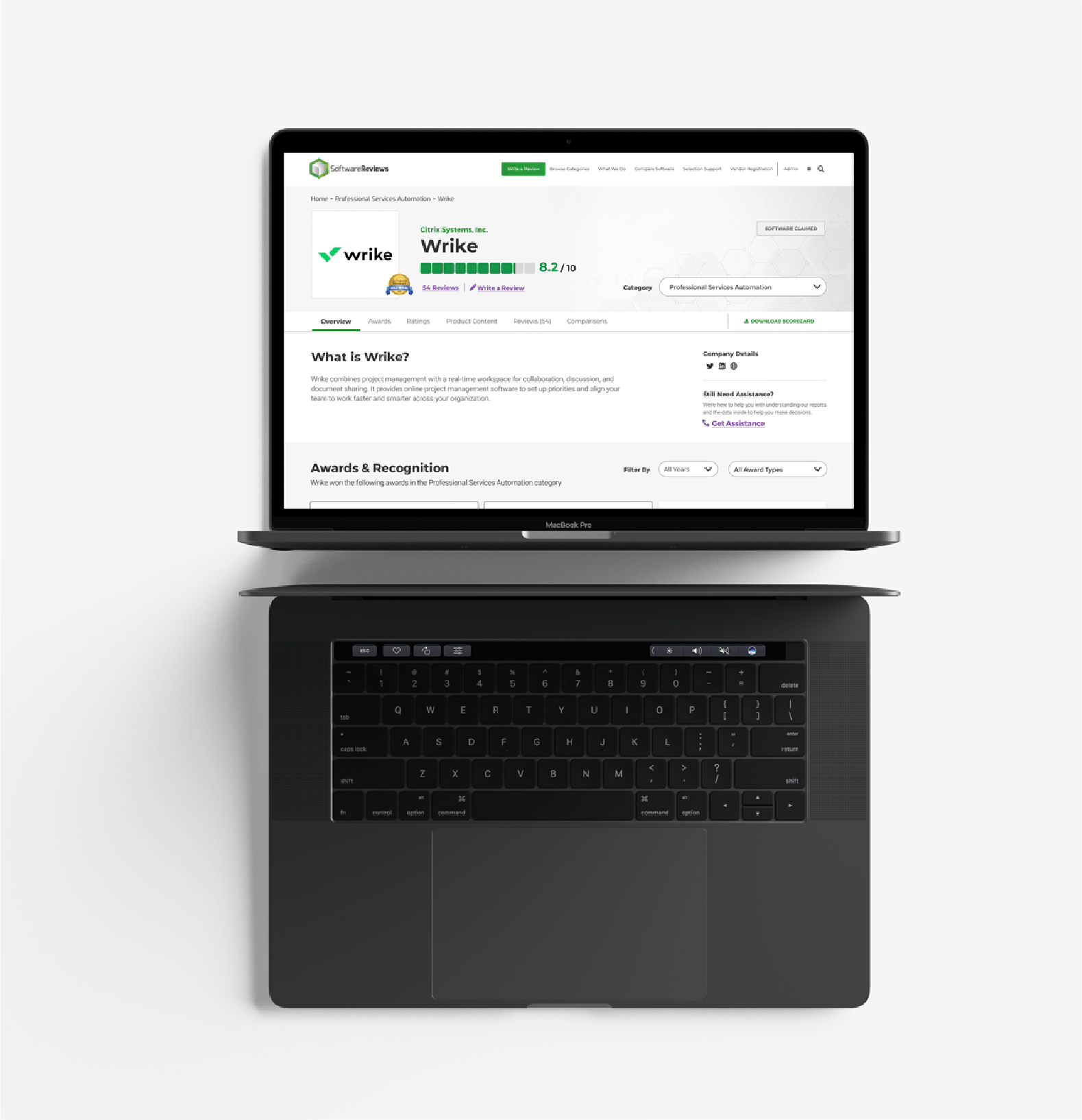
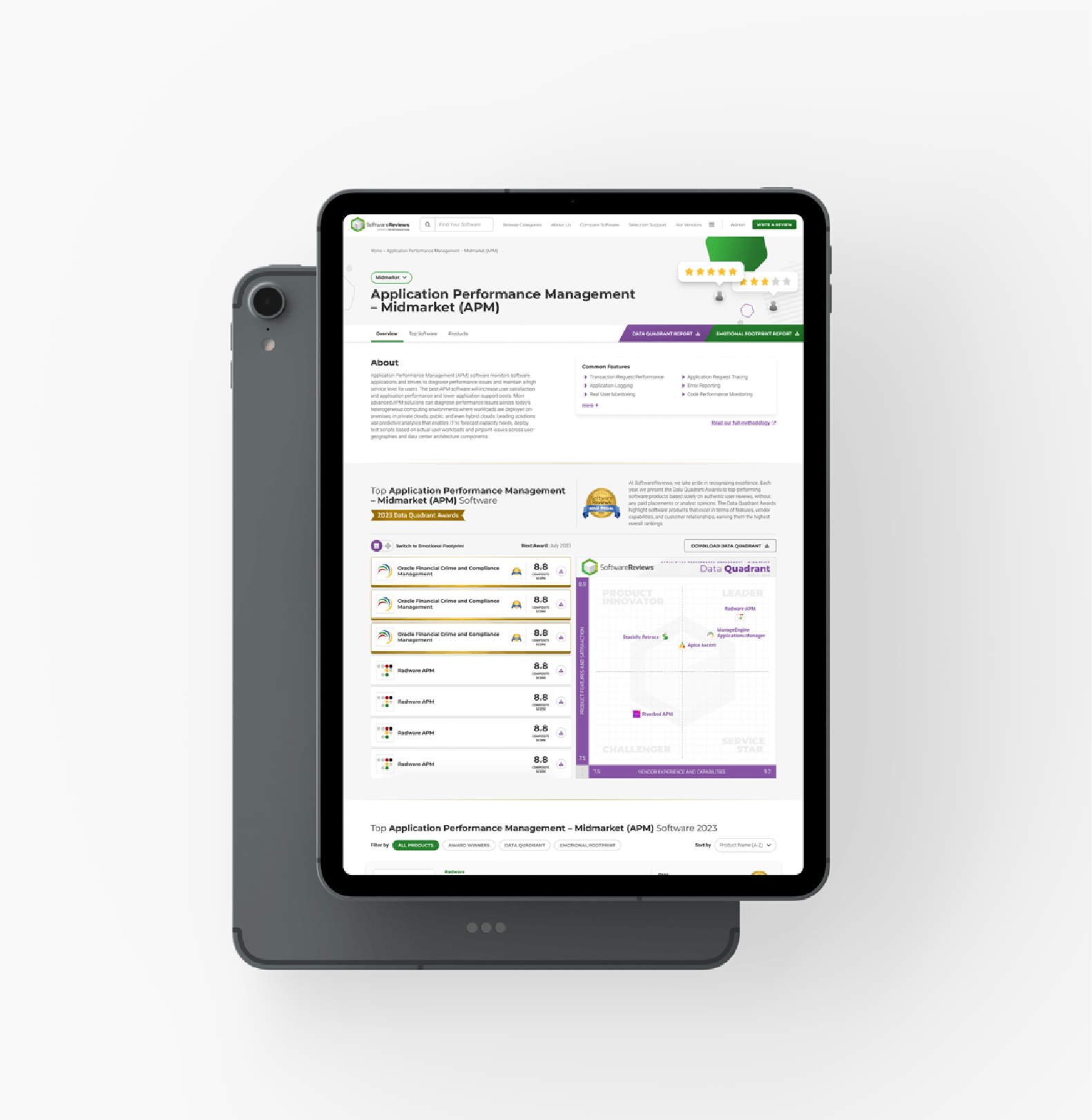
The redesign shipped as the new standard for how SoftwareReviews presents product and category data, replacing a model where users had to leave the page to get the information that mattered most. Beyond the page itself, the project changed how design and stakeholders worked together going forward: evidence-based hierarchy decisions, not opinion-led ones, became the expected way to resolve disagreements on future projects. As Design Director, I led design direction and project management across a team of 8 designers and developers, setting the strategic direction, reviewing and critiquing iterations, and acting as the bridge between the team's design rationale and stakeholder priorities, from initial research through final execution.